
Short note on accommodating the users display preferences on iOS
A characteristic of thoughtful, inclusive, design is to give control to users to interact with content in their preferred way.
When approaching application (app) design, we must include stories and requirements for accessibility. In addition, we should incorporate feedback from people with disabilities and follow technical accessibility best practices where applicable.
But to enhance a (hopefully) already good user experience, we should also consider adding requirements for our app to respond to users' preferences in their device accessibility settings.
Letting users interact with content in their preferred way will enhance the user experience and help with any permanent, temporary, or situational accessibility challenges they may face.
User preferences to support your app design
iOS provides several display customisations and font adjustments to allow a user to control how they interact with content.
Default UIKit framework views and controls come with display customisations included for free.
When implementing custom UI views and controls, display customisations and font adjustments need to be included in your requirements.
We'll be focusing on the following display customisations available through the iOS Accessibility API.
- Reduce transparency – This setting allows a user to reduce or remove the background transparency of UI (User Interface) elements that are otherwise implemented using semi-transparent backgrounds.
- Reduce motion – This setting allows users to turn off or reduce motion effects on UI elements.
- Bold text – This setting allows a user to make fonts heavier. This option will make thin, hard-to-see font lines thicker and easier to see.
What follows are some examples of how you might choose to use display accommodations as requirements to enhance your Design.
Example: Adding Reduce transparency into your design requirements
For some people with low vision or those experiencing vision challenges in bright sunlight, User Interface (UI) elements with solid backgrounds will be easier to read.
Adding in a requirement to allow user control to reduce or altogether remove this visual effect could look like this:
- Design: Include design variations for transparent and opaque backgrounds on UI elements.
- Development: Determine if the user has enabled "Reduce Transparency" by checking the state of
UIAccessibilityIsReduceTransparencyEnabled(). Update the UI accordingly. - Development: Determine if the user has adjusted the "Reduce Transparency" setting whilst using the app by listening for a notification from
UIAccessibilityReduceTransparencyStatusDidChange. Update the UI accordingly.
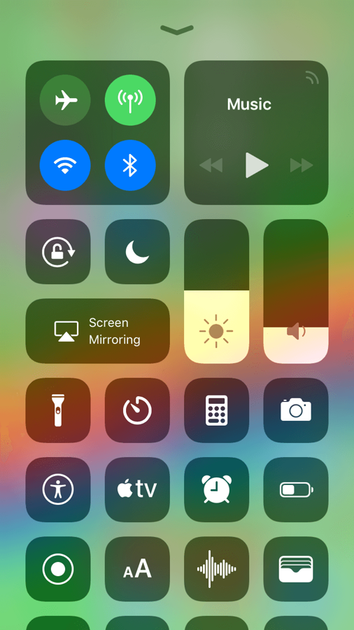
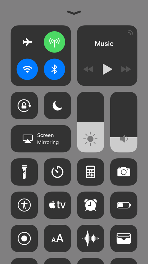
Reduced transparency in the iOS Control Centre
The iOS Control Centre provides an excellent example of accommodating the users' preference for reduced transparency.
- Through thoughtful design, a user can opt to increase the legibility of the control centre by enabling the "Reduce Transparency" setting.
- You can test this yourself by going to Settings > General > Accessibility > Increase Contrast > Reduce Transparency.
Example: Adding Reduce motion into your design requirements
Screen transitions, some types of animation, and zoom and parallax effects can cause some people to feel dizzy, nauseous or experience motion sickness when using a UI. In some scenarios, users may want to turn off motion effects to prolong their battery life.
Adding a requirement to allow user control to minimise or remove those motion effects could look like this:
- Design: Include variations for both cross dissolve and sliding in of new views. (A cross dissolve doesn't make use of any motion).
- Development: Determine if the user has enabled "Reduce Motion" by checking the state of
UIAccessibilityIsReduceMotionEnabled(). Update the UI accordingly. - Development: Determine if the user has adjusted the "Reduce Motion" setting whilst using the app by listening for a notification from
UIAccessibilityReduceMotionStatusDidChange. Update the UI accordingly.
Reduce motion in the iOS Weather app
The screen recording below shows the "city list" view in the iOS weather app.
Each city listed (Nottingham, Dublin, Palma, Belfast, Mormugao and Barcelona) shows the current time and temperature in the foreground text.
In addition, each city has an animated background of the sky to visually represent the current weather.

For example, Nottingham has some thick, fast-moving clouds against a dull grey sky, Mormugao shows a clear night sky with shooting stars, whilst Barcelona shows slow-moving white clouds in a clear, bright blue sky.
- This type of multi-speed movement may trigger nausea or motion sickness for some.
- Through thoughtful, inclusive Design, a user can opt-out of this experience by enabling the "Reduce Motion" setting.
- You can test this yourself by going to Settings > General > Accessibility > Reduce Motion.
Example: Adding Bold text to your design requirements
Reading light ultra-thin fonts on small screens can be challenging for many people, especially those with visual impairments, but even those who do not consider themselves to have a visual impairment.
Adding a requirement to allow user control to switch to a bold or semi-bold font could look like this:
- Design: Include designs for standard ultra-thin font and a bold font variant.
- Development: Determine if the user has enabled “Bold Text” by checking the state of the
UIAccessibilityIsBoldTextEnabled()boolean. Update the UI accordingly.
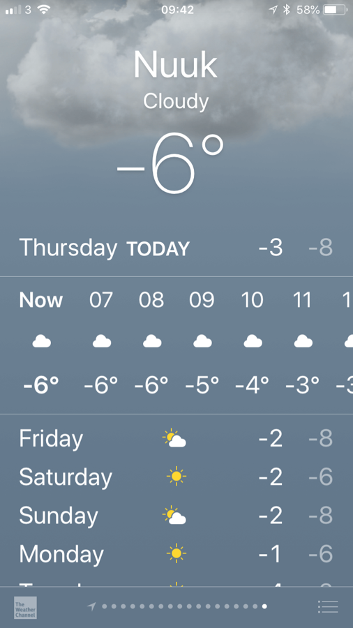
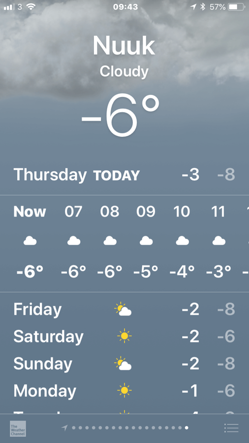
Bold text in the iOS weather app
The iOS weather app provides an excellent example of accommodating the users' preference for bold text.
- Through thoughtful Design, a user can opt to increase the legibility of the on-screen text by enabling the "Bold Text" setting.
- You can test this yourself by going to Settings > General > Accessibility > Bold Text.
Testing visual accommodations
In addition to testing on an actual device, 'Reduce Transparency' and 'Reduce Motion' can also be tested using the new Accessibility Inspector in Xcode – see WWDC 2016 – Auditing Your Apps for Accessibility.
At the time of writing, both 'Bold text' and 'Darken Colors' need to be tested on an actual device.
Summary
When we design with inclusion in mind, we must start with reasonable defaults - choosing appropriate colours, fonts and animation effects.
Display accommodations can enhance the user experience for a range of users with permanent, temporary, or situational accessibility challenges.
Standard UIKit framework views and controls come with display accommodations included for free.
Use custom views and controls when applicable to do so, but make sure that display accommodations and font adjustments are included in the requirements.
Display accommodations should not be used to fix a defective design. Instead, we should use them to enhance an already good user experience by giving control to users, allowing them to interact with content in their preferred way.
This article was originally published on The Paciello Group Developer Blog in April 2018.